This vignette covers topics related to phylogenetic beta diversity, including calculation of pairwise dissimilarity between sites, and use of these dissimilarity values in ordination and regionalization analyses.
To get started, let’s load the phylospatial library, as
well as tmap for visualization. Note that the functions
covered here all require a phylospatial object as input;
see vignette("phylospatial-data") for details on
constructing data sets. We’ll use the moss() example data
here.
Dissimilarity
The phylospatial package provides a range of methods for
calculating pairwise community phylogenetic distances among locations.
It can calculate phylogenetic versions of any quantitative community
dissimilarity metric available trough the vegan package,
including the various predefined indices provided through
vegan::vegdist as well as custom indices specified through
vegan::designdist. The default metric is Bray-Curtis
distance, also known as quantitative Sorensen’s dissimilarity.
Additional choices allow for partitioning dissimilarity in to turnover
and nestedness components.
Dissimilarity is computed using the function
ps_add_dissim(), which adds a distance matrix to the
dissim slot of your phylospatial data set. Or
if you just want the matrix itself, you can use
ps_dissim().
In addition to specifying the dissimilarity index to use, these
functions include options for different ways to scale the phylogenetic
community matrix before calculating dissimilarity. Setting
endemism = TRUE will scale every lineage’s occurrence
values to sum to 1 across all sites, giving greater weight to narrowly
distributed taxa. Setting normalize = TRUE scales every
site’s total occurrence value to sum to 1 across taxa, which results in
a distance matrix that emphasizes proportional differences in
composition rather than alpha diversity gradients.
Let’s run an example using quantitative Sorensen’s index, weighted by endemism. Printing the result, we can see it now contains dissimilarity data; this is a square distance matrix with a row and column for each site:
ps <- ps_add_dissim(ps, method = "sorensen", endemism = TRUE, normalize = TRUE)
ps
#> `phylospatial` object
#>   - 884 lineages across 527 occupied sites (1116 total)
#>   - community data type: probability
#>   - branch length rescaling: sum1
#>   - spatial data class: SpatRaster
#>   - dissimilarity data: sorensen
Distance decay
One frequent use of dissimilarity matrices is to analyze how commmunity phylogentic similarity declines with geographic distance, environmental difference, or other geographic properties. Common methods for this kind of analysis include generalized dissimilarity modeling and partial Mantel tests.
Here let’s just visualize how phylogenetic turnover changes with the
distance between sites. We can compute a pairwise geographic distance
matrix using ps_geodist(). Let’s also compare this to
non-phylogenetic species turnover, which we can compute by specifying
tips_only = TRUE. We can summarize the pattern with a LOESS
curve:
phy_beta <- as.vector(ps_dissim(ps, method = "sorensen"))
spp_beta <- as.vector(ps_dissim(ps, method = "sorensen", tips_only = TRUE))
geo_dist <- as.vector(ps_geodist(ps)) / 1000  # convert to km

# subsample for plotting (full pairwise set is huge)
ss <- sample(length(phy_beta), 5000)

plot(geo_dist[ss], phy_beta[ss],
     pch = ".", col = adjustcolor("steelblue", 0.3),
     xlab = "Geographic distance (km)",
     ylab = "Dissimilarity",
     ylim = c(0, 1))
points(geo_dist[ss], spp_beta[ss],
       pch = ".", col = adjustcolor("tomato", 0.3))

# loess trend lines
lo_phy <- loess(phy_beta[ss] ~ geo_dist[ss])
lo_spp <- loess(spp_beta[ss] ~ geo_dist[ss])
ox <- order(geo_dist[ss])
lines(geo_dist[ss][ox], predict(lo_phy)[ox], col = "steelblue", lwd = 2)
lines(geo_dist[ss][ox], predict(lo_spp)[ox], col = "tomato", lwd = 2)

legend("bottomright",
       legend = c("Phylogenetic", "Species"),
       col = c("steelblue", "tomato"),
       lwd = 2, bty = "n")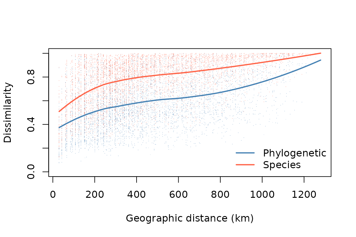
Ordination
Additional approaches for assessing spatial turnover patterns include
ordination or clustering, both of which reduce a dissimilarity matrix
into a lower-dimensional summary. Ordination, which is implemented in
the function ps_ordinate(), identifies the dominant axes of
variation in phylogenetic turnover, which can then be used for
visualization or analysis. The funtion offers various ordination
methods. Let’s perform a PCA, and make maps of the first four
dimensions:
ps %>%
      ps_ordinate(method = "pca", k = 4) %>%
      tm_shape() +
      tm_raster(col.scale = tm_scale_continuous(values = "brewer.pi_yg"),
                col.free = FALSE) +
      tm_title("Phylogenetic community ordination")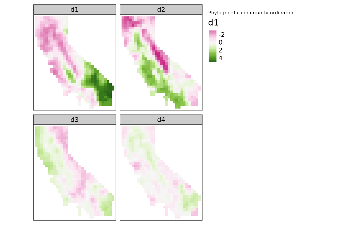
We can also qualitatively visualize compositional patterns by
converting ordination axes to a set of colors representing how similar
two sites are to each other, using the ps_rgb() function.
Let’s do that here, using the "cmds" (classical
multidimensional scaling) ordination algorithm, and then plot the result
using tmap::tm_rgb():
ps %>%
      ps_rgb(method = "cmds") %>%
      tm_shape() +
      tm_rgb(col.scale = tm_scale_rgb(max_color_value = 1),
             interpolate = FALSE) +
      tm_title("Phylogenetic community ordination")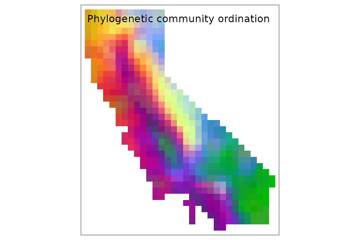
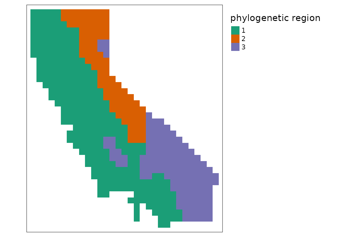
Regionalization
We can also perform a more formal cluster analysis that splits the
landscape into a set of evolutionary bioregions, using the
ps_regions() function. To do this, we need to specify the
clustering method and the number of clusters
(k). Choices of method include k-means and various
hierarchical clustering methods; note that results are sometimes highly
sensitive to which method is selected. The hierarchical methods require
a dissimilarity matrix calculated by first running
ps_add_dissim(), while k-means does not.
Choosing k is usually subjective. Many alternative
methods have been proposed in the literature to identify the “optimal”
number of clusters in a data set, but ecological data are often
inherently characterized by continuous gradients rather than discrete
provinces, in which case no value of k may clearly fit
best. You can use the function ps_regions_eval() to help
evaluate how well different choices for k fit the data by
comparing the variance explained by different numbers of clusters. Let’s
do that here, using the "average" hierarchical clustering
method:
ps_regions_eval(ps, k = 1:15, plot = TRUE, method = "average")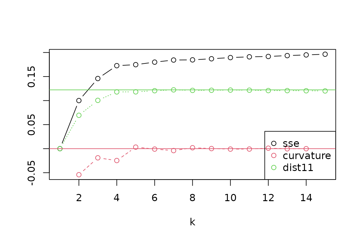 From the evaluation plot, it looks like a value of
 k = 4
stands out as the most distinct “elbow” in explained variance (“SSE”),
with near-maximum distance to the 1:1 line (“dist11”), and with more
negative “curvature” than its neighbors, though other choices could also
be reasonable. Let’s generate results for four regions, and then make a
map of these zones:
ps %>%
      ps_regions(k = 4, method = "average") %>%
      tm_shape() +
      tm_raster(col.scale = tm_scale_categorical(values = "brewer.dark2"),
                col.legend = tm_legend(show = FALSE)) +
      tm_title("phylogenetic region")