Getting started with windscape
windscape.RmdWind carries pollen, seeds, spores, insects, pathogens, and pollutants across landscapes. Unlike most landscape connectivity, wind connectivity is directional: air flows strongly in some directions and weakly in others, so a site can send much to its downwind neighbors while receiving little from them. windscape models this directional connectivity from time series of wind conditions, describing the expected connectivity produced by many dispersal events rather than any single one.
A windscape analysis follows a few steps:
-
Wind data: a time series of gridded wind vectors (a
wind_series). -
Wind rose: a summary of the time series as the
average conductance of wind from each grid cell toward each of its eight
neighbors (a
wind_rose). - Connectivity model: either a least-cost model, which finds the fastest routes through the wind rose, or a random walk model, which simulates particles diffusing through it.
- Analysis: mapping windsheds, the connectivity between a site and the whole landscape, or estimating pairwise connectivity among a set of sites, for comparison with ecological data.
This vignette walks through each step using small example data sets that ship with the package. For more details on specific topics, see the articles on wind data, random walk models, least cost models, and statistical tests (coming soon).
Wind data
Wind fields
The basic unit of wind data is a wind field: the
wind across a grid at a single moment, stored as two raster layers
giving the eastward (u) and northward (v)
components of the wind vector in each cell. wind_field()
creates one from a two-layer SpatRaster, or from one time
step of a wind time series. Here’s the first time step of the example
data, for midnight UTC on January 1, 2000:
series <- windscape_example("wind_series")
field <- wind_field(series, step = 1)

ggplot(field, aes(x, y)) +
      geom_raster(aes(fill = speed)) +
      geom_path(data = states, aes(long, lat, group = group), color = "white", linewidth = 0.2) +
      geom_wind_arrow(color = "white") +
      scale_fill_viridis_c(name = "wind speed\n(m/s)") +
      coord_quickmap(xlim = c(-120, -90), ylim = c(30, 50), expand = FALSE) +
      theme_void()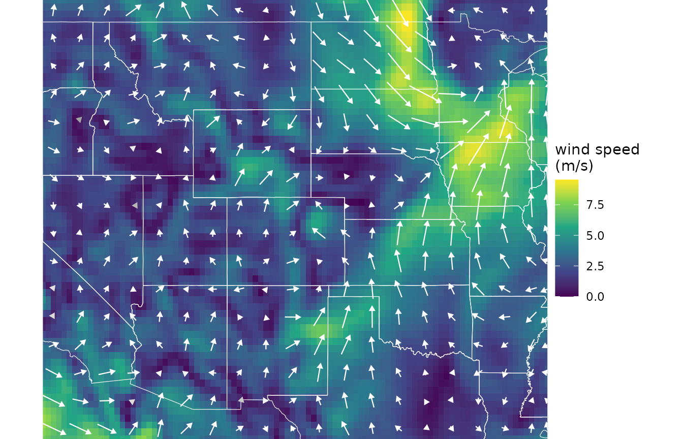
geom_wind_arrow() draws wind vectors, and
geom_wind_trail() draws trails that follow the airflow.
Wind fields are useful for visualizing the wind at a given moment, but
windscape’s connectivity models are built from many of them.
Wind time series
A wind_series is a sequence of wind fields stored as a
single SpatRaster: all the u layers, followed by all the v
layers, in the same time order. The example series covers the western
and central US at about 0.3 degree resolution, with 96 time steps from
the year 2000 (every 6 hours on the 1st and 15th of each month):
series
#> class       : SpatRaster
#> size        : 64, 96, 192  (nrow, ncol, nlyr)
#> resolution  : 0.3157895, 0.3174603  (x, y)
#> extent      : -120.1579, -89.84211, 29.84127, 50.15873  (xmin, xmax, ymin, ymax)
#> coord. ref. : lon/lat WGS 84 (EPSG:4326)
#> sources     : wind_usa.tif
#> names       : u 2000-01-01, u 200~00:00, u 200~00:00, u 200~00:00, u 2000-01-15, u 200~00:00, ...
#> min values  :         -0.4,        -0.4,        -0.6,        -0.6,         -0.4,        -0.5, ...
#> max values  :          0.7,           1,         0.9,           1,          0.7,         1.1, ...
Layer names record each time step. A real analysis would usually use far more data: windscape’s models describe the average behavior of the wind over the time series, and hourly data from many months or years captures its variability much better. Downsampled or averaged winds (e.g. monthly means) give poor results, because averaging cancels out winds blowing in opposite directions. How long a record to use depends on the question: decades for processes like gene flow that integrate over many generations, or a single season for dispersal during a flowering or sporulation period.
ncar_download() downloads hourly wind data from NCAR’s
Geoscience Data Exchange, with no account needed: ERA5 (1940 to
present), CFSR (1979-2010), and CFSv2 (2011 to present). Data are
clipped to a bounding box on the server and saved as one cached file per
month, which wind_series() combines into one series:
files <- ncar_download("era5", xlim = c(-120, -90), ylim = c(30, 50),
                       years = 2011:2020, time_stride = 3, dir = "~/wind_data")
series <- wind_series(files)
Wind data from other sources can be used too. Load it as a
SpatRaster on a longitude/latitude grid, with wind
components in m/s, and convert it with wind_series(). Its
order argument describes how the layers are arranged:
"uuvv" (all u layers, then all v layers) or
"uvuv" (alternating).
series <- wind_series(terra::rast("my_wind_data.tif"), order = "uvuv")Wind roses
A wind rose summarizes a wind time series into a model of the wind regime. For each time step, windscape divides the wind in each grid cell between the two neighboring cells whose directions bracket the wind direction, in proportion to how closely the wind points toward each. It then averages over all time steps, giving the mean conductance of wind from each cell toward each of its eight neighbors: the rate at which wind moves material from the cell to that neighbor, in units of 1/hour when wind speeds are in m/s.
rose <- wind_rose(series, trans = 1)
rose
#> class       : SpatRaster
#> size        : 64, 96, 8  (nrow, ncol, nlyr)
#> resolution  : 0.3157895, 0.3174603  (x, y)
#> extent      : -120.1579, -89.84211, 29.84127, 50.15873  (xmin, xmax, ymin, ymax)
#> coord. ref. : lon/lat WGS 84 (EPSG:4326)
#> source(s)   : memory
#> names       :       SW,        W,       NW,        N,       NE,        E, ...
#> min values  :        0,        0,        0,        0,  0.00034,   0.0003, ...
#> max values  : 0.115176, 0.164829, 0.205505, 0.278183, 0.195127, 0.440725, ...
The trans argument sets how wind speed translates into
conductance. The default, trans = 1, makes conductance
proportional to wind speed. Larger powers emphasize strong winds, for
example to model seeds that are only released in strong winds, and a
function can be supplied for other relationships, such as a threshold
speed; see ?wind_rose.
The rest of this vignette uses a wind rose that ships with the
package, built from a longer version of the example time series.
geom_wind_rose() maps a wind rose as a field of glyphs,
each showing the distribution of flow toward the eight neighbors in a
block of grid cells, colored by the direction of net flow:
rose <- windscape_example("wind_rose")

ggplot(rose, aes(x, y)) +
      geom_path(data = states, aes(long, lat, group = group), color = "gray70", linewidth = 0.2) +
      geom_wind_rose(res = 12) +
      coord_quickmap(xlim = c(-120.5, -89.5), ylim = c(29.5, 51), expand = FALSE) +
      theme_void()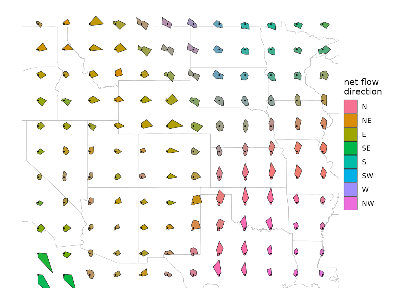
net_flow() reduces a wind rose to a single vector per
cell: the net direction and rate at which the rose moves material, on
balance. It returns a wind field, so it can be plotted the same way:
ggplot(net_flow(rose), aes(x, y)) +
      geom_raster(aes(fill = speed)) +
      geom_path(data = states, aes(long, lat, group = group), color = "white", linewidth = 0.2) +
      geom_wind_trail(color = "white", hours = 24) +
      scale_fill_viridis_c(name = "net flow\n(km/h)") +
      coord_quickmap(xlim = c(-120, -90), ylim = c(30, 50), expand = FALSE) +
      theme_void()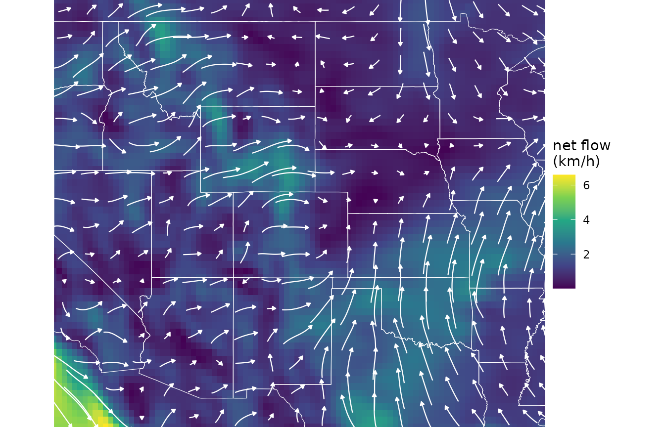
Two optional steps can adjust a wind rose before modeling.
weight_conductance() scales conductance by a raster of
weights between 0 and 1, for example to reduce connectivity across open
water for terrestrial organisms (ncar_land() downloads a
matching land-water layer). downscale() interpolates the
wind rose onto a finer grid. It rarely changes least-cost results, but
it does change random walk results, because a random walk’s spread
depends on cell size; see ?downscale before using it.
Connectivity models
windscape offers two ways to model connectivity from a wind rose. We’ll apply both to the same site in north-central Colorado:
site <- cbind(-105, 40)Least-cost paths
A least-cost model treats the wind rose as a network
of grid cells, where the cost of moving from a cell to a neighbor is the
inverse of the conductance between them. The least-cost route between
two places is the one with the lowest total cost, and its cost is a
travel time, in hours if the rose was built with trans = 1
from wind speeds in m/s.
These travel times are best understood as a measure of accessibility by wind. Each step’s cost is the time to cross it at the long-run average wind speed in that direction, which includes zeros for all the time the wind spends blowing in other directions. A travel time is therefore the time to follow the best route, including time waiting at a standstill for the wind direction to align roughly with the direction of travel. Travel times are comparable across places and directions, which is what most analyses need, but they don’t predict when real particles arrive.
wind_graph() builds the network, in one of two
directions. A "downwind" graph measures travel from the
site to other places, and an "upwind" graph measures travel
from other places to the site. least_cost_surface() maps
travel times between a site and every grid cell:
down <- least_cost_surface(wind_graph(rose, direction = "downwind"), site)
up <- least_cost_surface(wind_graph(rose, direction = "upwind"), site)

d <- rbind(data.frame(as.data.frame(down, xy = TRUE), direction = "downwind: from the site"),
           data.frame(as.data.frame(up, xy = TRUE), direction = "upwind: to the site"))

ggplot(d, aes(x, y)) +
      geom_raster(aes(fill = pmax(hours, 10))) + # floor at 10 hours for the log scale
      geom_path(data = states, aes(long, lat, group = group), color = "white", linewidth = 0.15) +
      geom_contour(aes(z = hours), color = "red", breaks = c(100, 200, 500, 1000), linewidth = 0.15) +
      annotate("point", site[1], site[2], color = "red", size = 1.5) +
      facet_wrap(~direction) +
      scale_fill_viridis_c(name = "hours", trans = "log10", direction = -1) +
      coord_quickmap(xlim = c(-120, -90), ylim = c(30, 50), expand = FALSE) +
      theme_void() +
      theme(strip.text = element_text(margin = margin(4, 0, 4, 0)))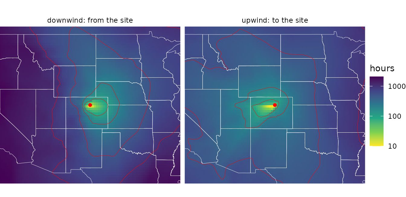
Places to the east are reached quickly from the site, while places to
the west are reached slowly, and the pattern reverses for travel to the
site. least_cost_paths() returns the routes themselves,
which can be drawn with geom_wind_trail().
Random walks
A random walk model instead simulates particles moving through the wind rose. At each time step, particles move from each cell to its neighbors at rates set by the conductances, so they spread along all routes in proportion to how much wind flows along them, rather than only along the fastest one. Particles are removed from the air at a constant rate, set by a half-life in hours, and the particles removed from each cell make up its deposition.
random_walk() has two modes. In "pulse"
mode, particles are released once and tracked over time, which shows how
a release spreads and drifts. Here are the airborne particles from a
single release after one, three, and seven days, with a half-life of
three days, each shown relative to its peak density (the total airborne
mass declines as particles are deposited):
pulse <- random_walk(rose, site, mode = "pulse", half_life = 72,
                     iter = 168, record = c(24, 72, 168))

d <- as.data.frame(pulse$airborne, xy = TRUE)
d <- data.frame(d[c("x", "y")], hours = rep(c(24, 72, 168), each = nrow(d)),
                density = unlist(d[-(1:2)]))
d$hours <- factor(paste(d$hours, "hours"), levels = paste(c(24, 72, 168), "hours"))
d$density <- d$density / ave(d$density, d$hours, FUN = max) # relative to each panel's peak
d$density <- pmax(d$density, 1e-3) # cells the particles haven't reached are exactly zero

ggplot(d, aes(x, y)) +
      geom_raster(aes(fill = density)) +
      geom_path(data = states, aes(long, lat, group = group), color = "white", linewidth = 0.15) +
      annotate("point", site[1], site[2], color = "red", size = 1) +
      facet_wrap(~hours) +
      scale_fill_viridis_c(name = "relative\ndensity", trans = "log10",
                           limits = c(1e-3, NA), oob = scales::squish) +
      coord_quickmap(xlim = c(-120, -90), ylim = c(30, 50), expand = FALSE) +
      theme_void() +
      theme(strip.text = element_text(margin = margin(4, 0, 4, 0)))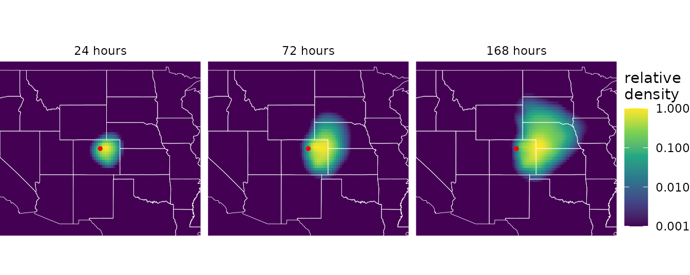
In "stream" mode, particles are released continuously,
and the model returns the long-run steady state: the share of particles
airborne over each cell (residence), and the share
deposited in each cell (deposition). This suits processes
that integrate over many releases, such as seed rain or gene flow. Like
least-cost models, random walks can run in either direction. A downwind
walk shows where particles released at the site end up, while an upwind
walk shows where particles deposited at the site came from (its
origin layer):
down <- random_walk(rose, site, mode = "stream", direction = "downwind", half_life = 48)
up <- random_walk(rose, site, mode = "stream", direction = "upwind", half_life = 48)
The half-life controls how far particles travel: short half-lives
keep them close to the source, while long half-lives let them spread
across the landscape, as they would for long-lived propagules or for
gene flow over many generations. With trans = 1 and winds
in m/s, it is in hours.
Windsheds
The least cost maps above are windsheds: by analogy to a watershed, the area a site’s propagules can reach (its downwind windshed), or the area its arriving propagules come from (its upwind windshed). Here are the site’s random walk windsheds:
d <- rbind(data.frame(fortify(down)[c("x", "y")], value = fortify(down)$deposition,
                      windshed = "downwind: where particles released here land"),
           data.frame(fortify(up)[c("x", "y")], value = fortify(up)$origin,
                      windshed = "upwind: where particles landing here come from"))
d$value <- d$value / ave(d$value, d$windshed, FUN = max) # relative to each windshed's peak

ggplot(d, aes(x, y)) +
      geom_raster(aes(fill = value)) +
      geom_path(data = states, aes(long, lat, group = group), color = "white", linewidth = 0.15) +
      annotate("point", site[1], site[2], color = "red", size = 1.5) +
      facet_wrap(~windshed) +
      scale_fill_viridis_c(name = "relative\ndensity", trans = "log10",
                           limits = c(1e-4, 1), oob = scales::squish) +
      coord_quickmap(xlim = c(-120, -90), ylim = c(30, 50), expand = FALSE) +
      theme_void() +
      theme(strip.text = element_text(margin = margin(4, 0, 4, 0)))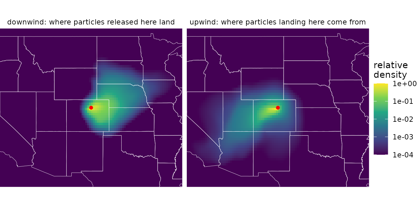
The downwind windshed extends east of the site and the upwind
windshed extends to the west, reflecting the prevailing westerly winds.
To compare windsheds across many sites, ws_summarize()
reduces a windshed to summary statistics such as its centroid and its
mean bearing from the site.
Pairwise connectivity
For a set of sites, such as sampled populations,
pairwise_least_cost() and
pairwise_random_walk() estimate wind connectivity between
every pair, as matrices in which element [i, j] describes
flow from site i to site j. Because wind
connectivity is directional, these matrices are asymmetric
([j, i] can differ strongly fom [i, j]).
Let’s generate ten random sites:
The two models place sites on the wind grid differently.
pairwise_least_cost() uses each site’s actual location: it
adds the sites to the wind graph and links each one to the centers of
nearby grid cells, and to other sites close by, with exact travel times.
It therefore handles sites that are close together, even within the same
grid cell. Least-cost travel times, in hours:
hours <- pairwise_least_cost(wind_graph(rose), sites)
round(hours[1:5, 1:5])
#>      [,1] [,2] [,3] [,4] [,5]
#> [1,]    0   96  401  480  700
#> [2,]  342    0  389  386  789
#> [3,] 1095  869    0  423  853
#> [4,] 1334 1089  421    0 1145
#> [5,]  886  918  181  599    0
A random walk moves particles from cell to cell, so
pairwise_random_walk() treats each site as the grid cell it
falls in. For sites only a few cells apart, the distances and directions
between cell centers can differ noticeably from those between the sites
themselves, and sites in the same cell get identical results.
check_cell_distance() reports how much the grid distorts
distances among a set of sites:
check_cell_distance(rose, sites)
#> Total point pairs: 45
#> Point pairs in the same grid cell: 0 (0%)
#> Distribution of cell-point distance discrepancies:
#>  0--1%: 21 (46.7%)
#>  1--2.5%: 15 (33.3%)
#>  2.5--5%: 8 (17.8%)
#>  5--10%: 1 (2.22%)
#>  10--25%: 0 (0%)
#>  25--Inf%: 0 (0%)
None of these sites share a grid cell, and most distance
discrepancies are under 2.5 percent, so this grid works for them. Where
many pairs are affected, a finer grid, from finer wind data or from
downscale(), separates nearby sites. But a random walk’s
spread depends on cell size, so changing the resolution changes the
model as well as the grid; see ?downscale.
Random walk deposition, the density of particles released at each site that are deposited at each other site:
deposition <- pairwise_random_walk(rose, sites, half_life = 48)
signif(deposition[1:5, 1:5], 2)
#>         [,1]    [,2]    [,3]    [,4]    [,5]
#> [1,] 4.2e-05 2.2e-06 4.0e-08 3.2e-10 2.3e-12
#> [2,] 1.2e-08 5.5e-05 1.3e-08 1.1e-09 7.4e-14
#> [3,] 1.0e-17 1.6e-16 4.2e-05 3.3e-10 1.4e-15
#> [4,] 7.8e-20 1.3e-18 2.3e-09 3.4e-05 2.7e-18
#> [5,] 8.9e-17 6.6e-17 1.7e-06 3.5e-11 4.8e-05
The diagonal of the deposition matrix is each site’s self-retention: the density of its own release deposited in its own grid cell. It is usually much larger than the other values, but the tests below ignore diagonals.
Testing hypotheses
Pairwise wind connectivity can be compared with pairwise ecological data, such as genetic differentiation or gene flow, to test whether wind shapes ecological patterns. windscape provides tools for testing several kinds of hypotheses (see Kling and Ackerly 2021 for examples):
- Flow: is directional wind connectivity related to directional ecological flow, such as gene flow? Compare the matrices directly.
-
Isolation: are sites with weaker wind connectivity
in both directions more different, for example genetically?
pairwise_means()converts an asymmetric matrix into a symmetric one by averaging the two directions. -
Asymmetry: are imbalances in wind connectivity
related to imbalances in ecological flow?
pairwise_ratios()converts a matrix into log ratios of the two directions.
mantel_test() tests these relationships with Mantel
tests, which assess significance by permutation, since the values in a
pairwise matrix aren’t independent. Unlike most implementations, it
handles asymmetric matrices and multiple control variables. Here we run
each test against simulated random data, using geographic distance as a
control variable for the flow and isolation tests:
set.seed(1)
distance <- point_distance(sites)
gene_flow <- matrix(runif(100), 10) # simulated gene flow
gene_diff <- pairwise_means(matrix(runif(100), 10)) # simulated genetic differentiation

flow <- mantel_test(deposition, gene_flow, z = list(distance))
isolation <- mantel_test(pairwise_means(hours), gene_diff, z = list(distance))
asymmetry <- mantel_test(pairwise_ratios(hours), pairwise_ratios(gene_flow))

sapply(list(flow = flow, isolation = isolation, asymmetry = asymmetry),
       function(x) round(c(stat = x$stat, p.value = x$p.value), 3))
#>           flow isolation asymmetry
#> stat    -0.103     0.045     0.154
#> p.value  0.358     0.757     0.280
As expected for random data, none of the relationships are significant. With only ten sites, these tests also have little power; real analyses generally need more sites.
Learn more
The package website has articles on each part of the workflow in more depth:
- Wind data: choosing, downloading, and preparing wind data, and building wind roses from long records.
- Windsheds: mapping and comparing site-to-landscape connectivity with least-cost and random walk models.
- Pairwise connectivity: estimating connectivity among sites and testing hypotheses about the role of wind in ecological patterns.
windscape implements and extends methods introduced in:
- Kling, M. M., and D. D. Ackerly. 2020. Global wind patterns and the vulnerability of wind-dispersed species to climate change. Nature Climate Change 10: 868-875.
- Kling, M. M., and D. D. Ackerly. 2021. Global wind patterns shape genetic differentiation, asymmetric gene flow, and genetic diversity in trees. Proceedings of the National Academy of Sciences 118: e2017317118.