Demographics of disaster
[WEB APP] Which populations bear the brunt of extreme weather? An interactive visualization.
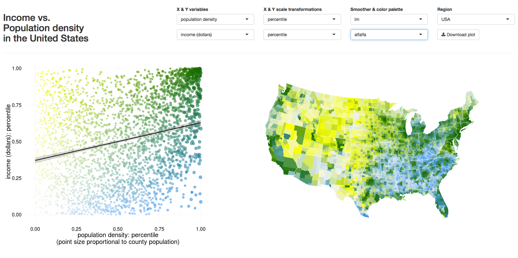
As part of a group project for the DS421 NRT program here at UC Berkeley, I led our team’s construction of a little web app called Demographics of Disaster. The visualization uses a mashup of extreme weather data and US Census data to let users explore the geographic distribution of populations' exposure to climatic disasters. It’s also useful for exploring relationships within each of those two categories, such as the above illustrations of relationships between income and population density. The app is built entirely in R using Shiny for the bones and ggplot2 for the meat.