The shape of the seasons
[VISUALIZATION] Exploring climate seasonality across space and time.
We’ve all seen plenty of maps and graphs that show how temperature or precipitation varies across space, or across seasons, or across decades of climate change. In this visualization I took a stab at bringing all those pieces together in one chart. (My philosophy: no such thing as TMI.) Click here for a zoomable pdf.
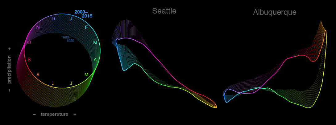
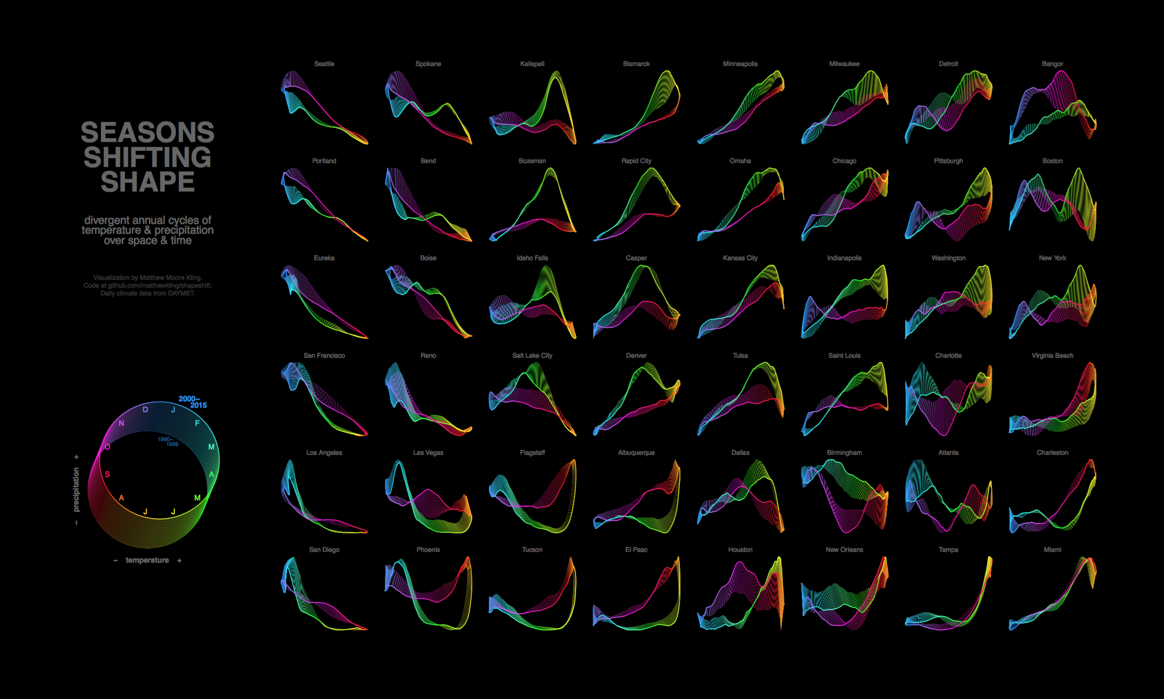
The tiles in this graphic show the seasonal climate cycles of 48 US cities, arranged in a loosely geographic array. Each city’s loop depecicts the daily climate progression around the calendar year, with temperature on the x axis and precipitation on the y axis. Color indicates the time of year. Recent climate change can be seen by comparing the bright path in the foreground (average daily climate from 2000–2015) to the dim path in the background (1980–1999); the lines spanning the two circuits show climate change for each of the 365 unique days of the year. The chart summarizes 1.6 million historic daily temperature and precipitation values from DAYMET. Thanks to DAYMET’s API and the beautiful versatility of ggplot2, I was able to script the entire pipeline from data acquisition through final pdf assembly.

Some pretty interesting patterns jump out from this perspective. Most obivously, seasonal relationships between temperature and precipitation are super different across the US. The west coast has tight negative correlations between seasonal temperature and precipitation, i.e. wet winters and dry summers; southeastern coastal climate is precisely the opposite, with dry winters and wet summers. In other locations where climate doesn’t fall along a straight line, seasonal patterns are more complex. Places like Indianapolis with open circles have different climates in spring versus fall. Smiley or frowny graphs are places two distinct precipitation peaks during the year (e.g. during summer and winter in Flagstaff, or spring and fall in Dallas). A single color spread over a large stretch of the circuit represents a rapid seasonal shift—check out the abrupt onset of the monsoon rains in the Southwest.
Longer term climate trends emerge with a bit more study. Horizontal shifts show changing temperatures, while vertical shifts show changing precipitation. All that downward blue and purple movement on the west coast: the recent drought. The rightward creep of many seasons in many locations, with hardly any leftward motion: anthropogenic climate change getting off the starting blocks. Lots more vertical than horizontal movement overall: a sign of the large year-to-year variability in precipitation relative to temperature.
