analogs
[R PACKAGE] Tools for fast, flexible climate analog analysis

Overview
analogs is an R package for climate analog analysis, a set of methods widely used in climate change ecology and biogeography. The package provides fast, flexible tools for searching large reference datasets to find locations that best match query sites based on climate similarity and geographic proximity.
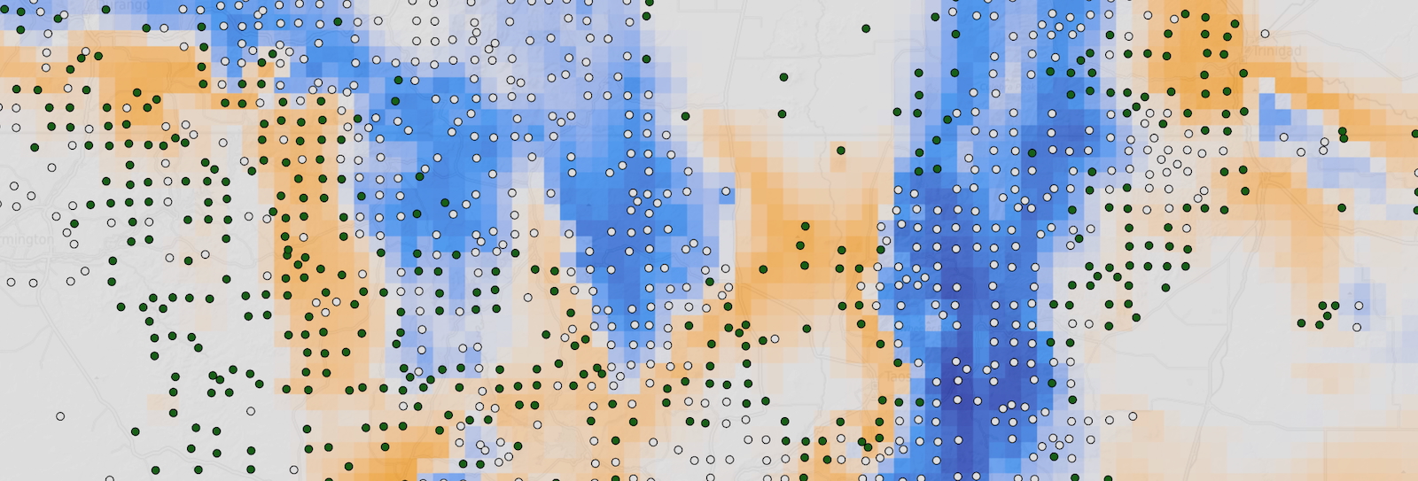
Climate analog methods underpin a range of applications in climate change research, from estimating climate velocity—the speed at which climate conditions shift across a landscape—to predicting ecological impacts using analog-based models that leverage spatial patterns as a proxy for temporal change. The analogs package provides a unified framework for these diverse applications, with a focus on computational efficiency and methodological flexibility.
Key Features
- Core search architecture with a flexible
analog_search()function and simplified wrappers for common analysis types - Climate velocity analysis via
analog_velocity()to find the nearest geographic locations with analogous climates under projected change - Analog impact models via
analog_impact()to predict ecological state variables by aggregating conditions at climate-similar locations - Analog availability via
analog_availability()to count and map the density of climate analogs within specified constraints - Flexible distance metrics including Euclidean and Mahalanobis climate distances, and support for both projected and lon-lat geographic coordinates
- Computational efficiency features including use of a lattice search index built in C++, support for multi-thread parallel processing, optional adaptive downsampling for fast approximate results, and memory-safe queries for large raster datasets
Resources
The package is available on GitHub and can be installed with:
pak::pak("matthewkling/analogs")
Full documentation and examples are available at the package website.